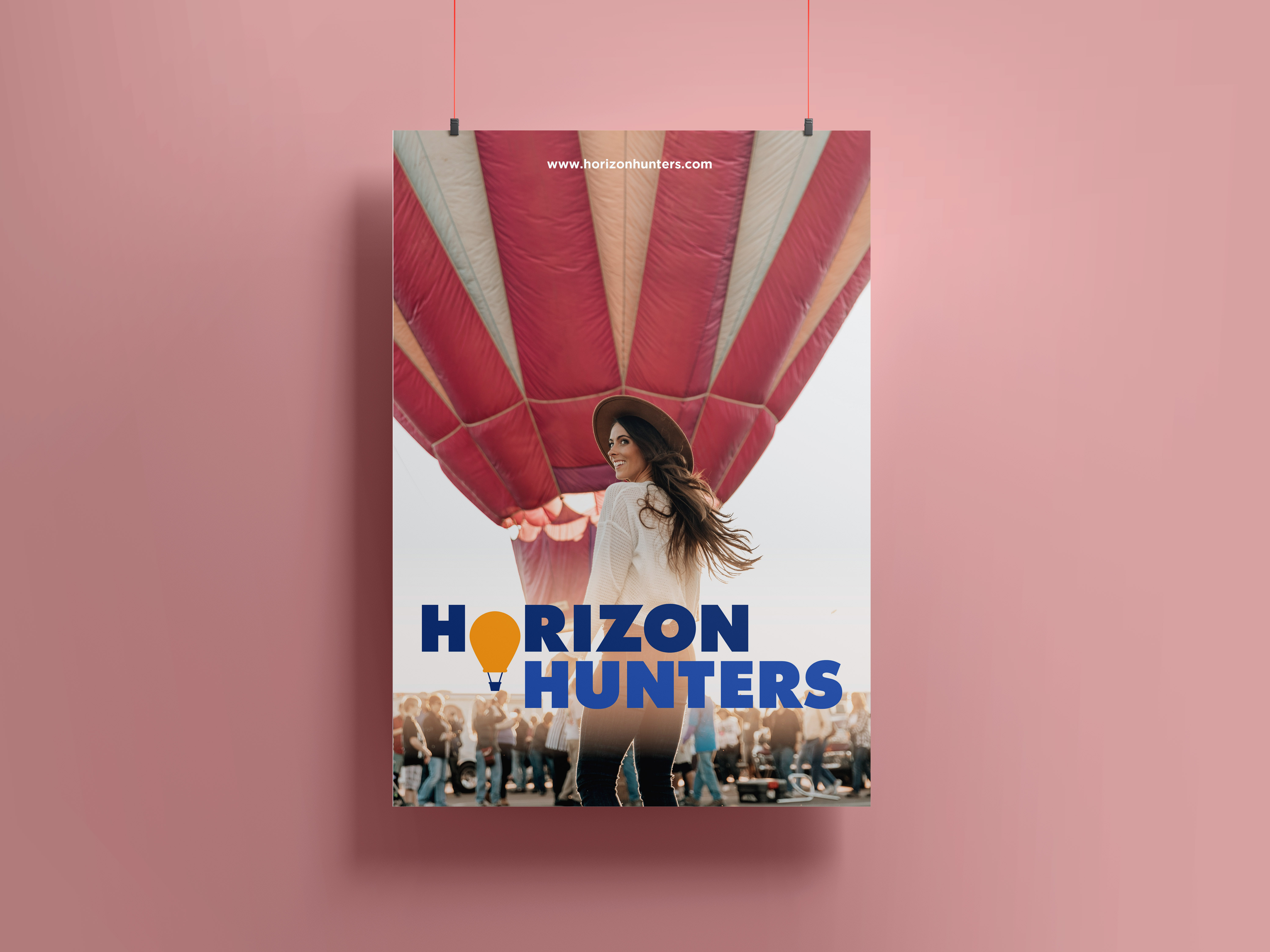
Taking out a letter and using a symbol is always a great way to make a logo standout and add contrast. In this case substituting the first “o” for the hot air balloon provides an offset in balance, and colour which provides a more inclusive look and what the brand is about.


